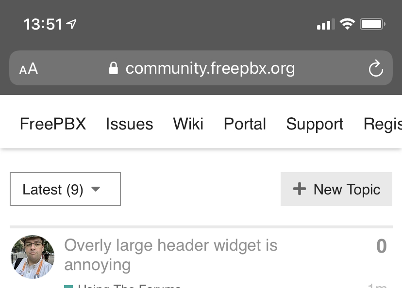
Why do you have a hard link in the discourse header widget for Registering? I am obviously already registered..

I can answer that. Those use a specific add-on for Discourse to add links to the top. Making it more intelligent requires custom HTML (if I recall there was some before but it didn’t style in things and was more difficult to maintain) and editing things about Discourse which is more maintenance. Therefore across both Asterisk and FreePBX community forums, it uses that add-on instead. I’ll see if there’s alternatives, but in general keeping things as vanilla as possible is a goal.
At least find one that lets a mobile user see their notifications or something. I have to flip into landscape mode on mobile to see that or search.
As I stated, I will see if there’s alternatives or what can be done.
1 Like
Does the same for me. I chalk it up to a lack of responsive styling. But since I get notice alerts on my phone, seeing a number next to an icon isnt that important to me. I know what notifications are there.
This topic was automatically closed 365 days after the last reply. New replies are no longer allowed.